


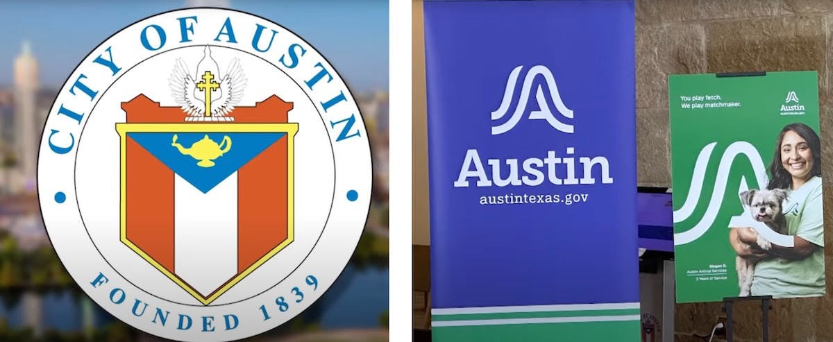
City Of Austin Mocked Over $1.1M Rebrand, New Logo: ‘Looks Like A Box Of Girl Scout Cookies’
The city of Austin just introduced a new logo, and based on the response so far, they may have really jumped the Cracker Barrel with this one.
Live Your Best Retirement
Fun • Funds • Fitness • Freedom
Austin City Manager T.C. Broadnax unveiled the newly designed logo for the city at a press conference on Thursday morning. “For the first time in Austin’s history, we will have a logo to represent the city services and unify us as one organization, one Austin,” the city employee said, per local NBC affiliate KXAN.
The entire project, including payments for brand vendors and a public awareness campaign, cost taxpayers more than $1.1 million.
The original logos for Austin had many symbolic elements, while the new one is incredibly simplified by comparison. This led to a lot of negative comments online from people who believe the redesign is a downgrade.
“Austin drops $1.1M taxpayer dollars on a logo redesign while claiming ‘efficiency’ – peak bureaucratic delusion. Residents rightly call it insane…” one commenter on X wrote.
“This rebranding circus started in 2018 under previous leadership, proving establishment politicians always prioritize optics over substance. That million could’ve repaired roads, bolstered emergency services, or provided tax relief. Instead, Austinites get abstract squiggles representing ‘movement’ while their infrastructure crumbles. Classic government waste: invent problems to justify self-serving spending sprees.”
Another commenter said, “It’s okay, but it looks like a corporate logo. The drawback for me is that it looks like a box of girl scout cookies. It does not make me think of Austin or Texas and they could have drawn from a number of things that would exemplify this specific city.”
It’s okay, but it looks like a corporate logo. The drawback for me is that it looks like a box of girl scout cookies. It does not make me think of Austin or Texas and they could have drawn from a number of things that would exemplify this specific city. pic.twitter.com/jw9LGpucKL
— Jack Salmon (@seamonkey10) September 5, 2025
“I’m starting to think these expensive rebrands are actually some form of money laundering,” a third person wrote, referencing the viral Cracker Barrel rebrand fiasco.
Broadnax said during the press conference that he was “glad to champion” the redesign because “there is a very real business need for a unified brand.”
He also mentioned that Austin has more than 300 logos used in different departments, which is why the single unified logo was created.
“We want our community members to be able to identify members of our team as city of Austin employees and trust the services we provide, whether they see the brand on a website, a utility bill, a street sign, or the side of a vehicle, they’ll know exactly who it’s from and what it stands for,” Broadnax said.
“Austinites told us that they value and appreciate their interaction with city staff, but they also want a modern government that reflects the community’s values and is consistent, connected, and responsive across departments and services, and that’s what this brand does.”
Originally Published at Daily Wire, Daily Signal, or The Blaze
What's Your Reaction?
 Like
0
Like
0
 Dislike
0
Dislike
0
 Love
0
Love
0
 Funny
0
Funny
0
 Angry
0
Angry
0
 Sad
0
Sad
0
 Wow
0
Wow
0