Serifs Strike Back: Rubio Rejects Biden’s DEI-Driven Font Agenda
The Biden administration’s State Department went full DEI on its diplomats — so full that it changed the official typeface of America’s foreign service, a problem that has been rectified by Secretary of State Marco Rubio.
Live Your Best Retirement
Fun • Funds • Fitness • Freedom
In 2023, former Secretary of State Antony Blinken, following the sage advice of the department’s Office of Diversity and Inclusion, decreed that all official communications ditch the venerable Times New Roman font and adopt the modern, sans-serif Calibri. The rationale? Accessibility. Calibri, with its soft curves and wide spacing, is supposedly easier for readers with dyslexia, low vision, or those using screen readers. The Biden administration decided that the shape of letters could save the planet — or at least make it slightly easier for a diplomat to decipher a memo.
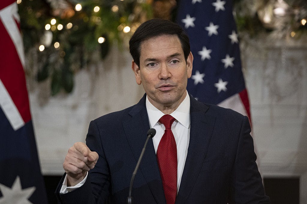
Enter Rubio, who on Tuesday dropped the bureaucratic hammer: Calibri was canceled. Times New Roman, back in all its serif glory, was reinstated, 14-point and all.
Rubio’s cable to all American diplomatic posts, titled, “Return to Tradition: Times New Roman 14-Point Font Required for All Department Paper,” stated, “To restore decorum and professionalism to the Department’s written work products and abolish yet another wasteful DEIA program, the Department is returning to Times New Roman as its standard typeface. … This formatting standard aligns with the President’s One Voice for America’s Foreign Relations directive, underscoring the Department’s responsibility to present a unified, professional voice in all communications.”
Christmas Sale – Get 40% off New DailyWire+ Annual Memberships
Rubio called the Calibri switch “wasteful” and “the degradation of the department’s official correspondence.” Serif fonts, he pointed out, have gravitas, history, and small decorative strokes — small strokes that apparently signal “professionalism” to anyone who matters in international diplomacy. Calibri, by contrast, was informal and clashed with official letterhead.
The lengths the Biden administration went to in the name of DEI here are almost comical. Not content with conventional anti-discrimination or accessibility programs, they weaponized typography, tinkering with letter shapes and point sizes — moving from 14 to 15 points — for the supposed benefit of readers who might struggle with letters. Accessibility advocates cheered; traditionalists grimaced.
Rubio’s reversal reads like a return to classical civilization, citing Roman antiquity and the script on the side of Air Force One as justification for reinstating serifs. The underlying story is less about fonts than about the extreme lengths to which the Biden administration pursued DEI, turning even the most mundane elements of office life — point sizes, font shapes, the very appearance of text — into battlegrounds for ideology.
Under Biden, DEI became so pervasive, so absurdly detailed, that the font on your official memo wasn’t just about readability — it was a statement, a policy, and, apparently, a revolutionary act. Rubio just undid it, and the world of diplomacy is back to serif conservatism.
What's Your Reaction?
 Like
0
Like
0
 Dislike
0
Dislike
0
 Love
0
Love
0
 Funny
0
Funny
0
 Wow
0
Wow
0
 Sad
0
Sad
0
 Angry
0
Angry
0
I am just an average American. My teen years were in the late 70s and I participated in all that that decade offered. Started working young, too young. Then I joined the Army before I graduated High School. I spent 25 years in, mostly in Infantry units. Since then I've worked in information technology positions all at small family owned companies. At this rate I'll never be a tech millionaire. When I was young I rode horses as much as I could. I do believe I should have been a cowboy. I'm getting in the saddle again by taking riding lessons and see where it goes.


Comments (0)